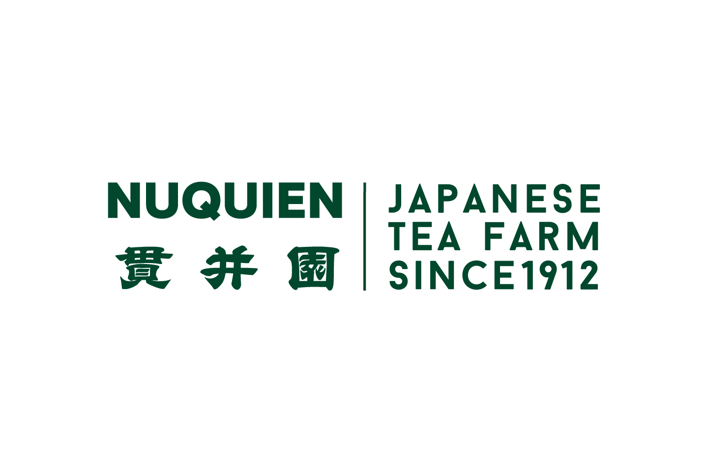
NUQUIEN is a long-established tea farm in Iruma, Saitama Prefecture that has been running for over 100 years. This branding project was to expand the business in Europe and Asia.
By matching the original Kanji logo and modern alphabet typography, the logo impresses both traditional and newness. Changed the spelling from NUKUIEN to NUQUIEN so that the name is easier to pronounce.
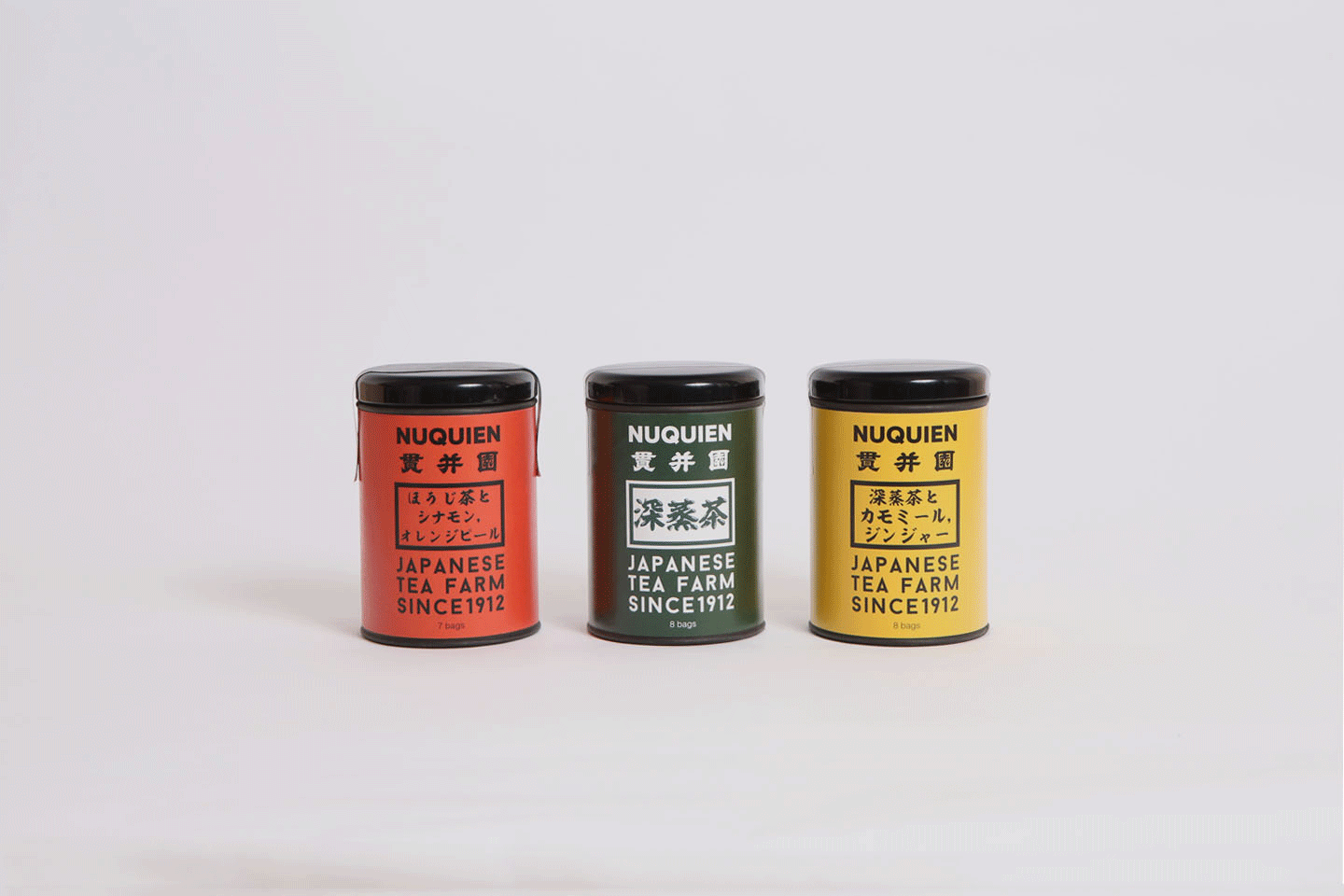
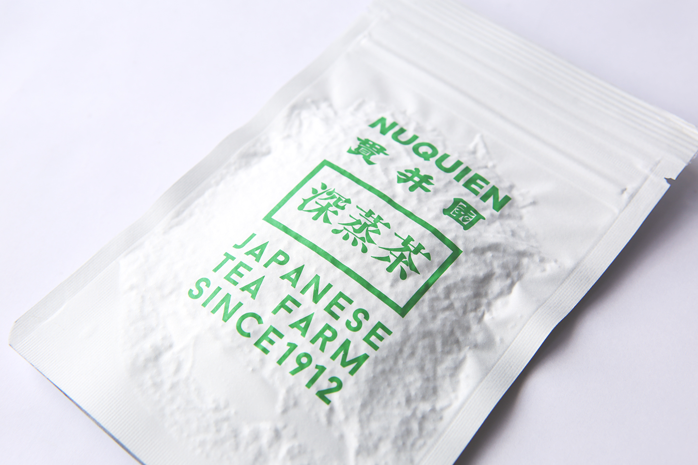
Vivid color packaging is rare and unique for ordinary Japanese tea packaging. Dark green, yellow, and orange are linked to each taste. Since this was branded for the international market, the packaging is appealing that it is a “made in Japan” product known for its safety and high quality. Brushstroke typography makes it easy to see “JAPANESE”.